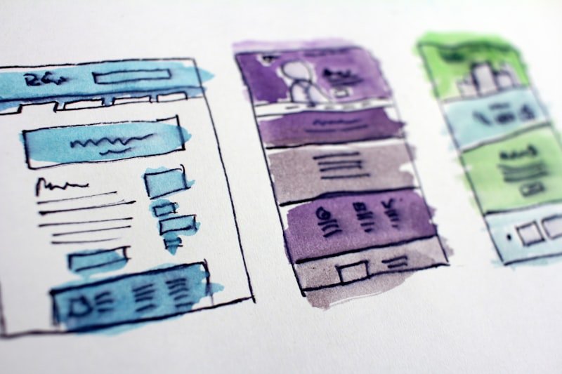
With most web traffic coming from mobile devices, touch ergonomics are critical. Let's design mobile interfaces optimized for thumb access.
The Thumb Zone Mapping
Most users navigate mobile screens with one hand. Keep primary actions and navigation tabs within the bottom third of the screen for comfortable thumb access.
Sizing and Spacing Touch Targets
Ensure touch targets are at least 48x48 pixels, with sufficient padding. This prevents accidental taps on adjacent items and improves usability.
Sticky Bottom Actions
Place key transaction buttons (e.g. Add to Cart, Submit) in sticky bottom sheets, keeping primary actions accessible at all times.
The Psychology of Visual Hierarchy & User Conversion
High-performing user interfaces do not just look attractive—they guide the user's attention systematically toward key conversion goals. By using appropriate contrast ratios, consistent typography scales, and generous whitespace, you reduce cognitive load and increase trust. Studies in user behavior show that readers scan layouts in either 'F' or 'Z' patterns. By positioning call-to-actions along these natural eye paths, companies can see conversion lifts of up to 40%. Additionally, color psychology plays a massive role: cool tones like blue establish a secure atmosphere, while warm accent colors call attention to secondary elements.
Fundamental Design Rules
- Contrast & Accessibility: Maintain strict WCAG 2.1 AA compliant color contrasts across text and background elements to guarantee universal readability.
- Tactile Micro-interactions: Provide immediate, subtle animations on button hover or form submission to give users physical confirmation of their inputs.
- Responsive Fluid Typographies: Design using dynamic unit values like rem or viewport percentages so that headings scale naturally from mobile viewports to large displays.
- Consistent Spacing Systems: Adopt an 8-pixel grid scale to layout dimensions, padding heights, and margin gaps, guaranteeing visual harmony across templates.
Inclusive and Accessible Digital Experiences
Universal accessibility is not just a compliance requirement—it is a core pillar of premium user experience design. Designing for inclusivity means ensuring that users with visual, auditory, motor, or cognitive impairments can navigate your application seamlessly. This involves supporting screen reader accessibility through semantic markup, providing descriptive image alt texts, and ensuring that all interactive controls are fully keyboard-navigable. By integrating accessibility audits early into the design phase rather than treating it as an afterthought, product teams build deeper trust and expand their reachable market to millions of additional users.
Developing a Scalable Design System
As digital products grow, maintaining design consistency across different platforms and teams becomes challenging without a centralized source of truth. A design system solves this by unifying UI components, typography scales, color palettes, and spacing tokens into a single, cohesive framework. By building modular component libraries in code that mirror design assets, developers can construct pages rapidly while maintaining brand guidelines. Design systems also foster cross-functional collaboration, enabling design and development teams to speak a unified design language.